A working eSIM concept in roughly two days
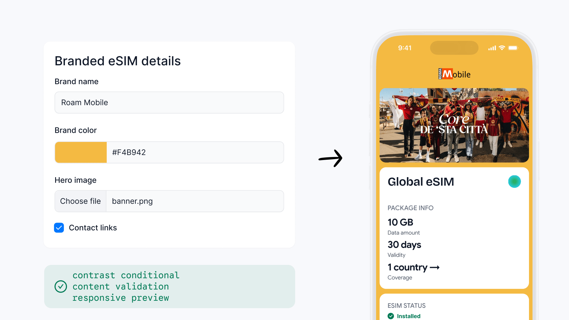
Starting from a PRD and known technical constraints, I designed and coded a functional Next.js and Tailwind concept that made the interaction model tangible for product review and client conversations.
- Role
- Designer · prototype developer
- Build
- Roughly two working days
- Prototype stack
- Next.js · Tailwind
- Team
- PM · Engineering
Note: images and some details have been modified per agreement with Yesim.
The PRD described inputs, not behaviour
There was no Figma stage before the prototype. I started from the PRD, existing product context, and known technical constraints. The requirements described logos, banners, brand colours, and optional contact details, but they did not show how those inputs would change the customer experience.
The two-day goal was a working concept, not implementation-ready UI. I needed something that could expose interaction and technical constraints, give the team a real product model to discuss, and make the idea credible in conversations with existing B2B clients.
Why I moved the design into code
I translated the PRD directly into a Next.js and Tailwind concept so the form, rules, and responsive preview ran together. In roughly two working days, I had a testable interaction model. Production-ready UI was outside that scope.
The PRD provided
Requirements, existing product context, and known technical constraints.
Code resolved
Live input, branching content, validation, cropping, loading, and responsive states.
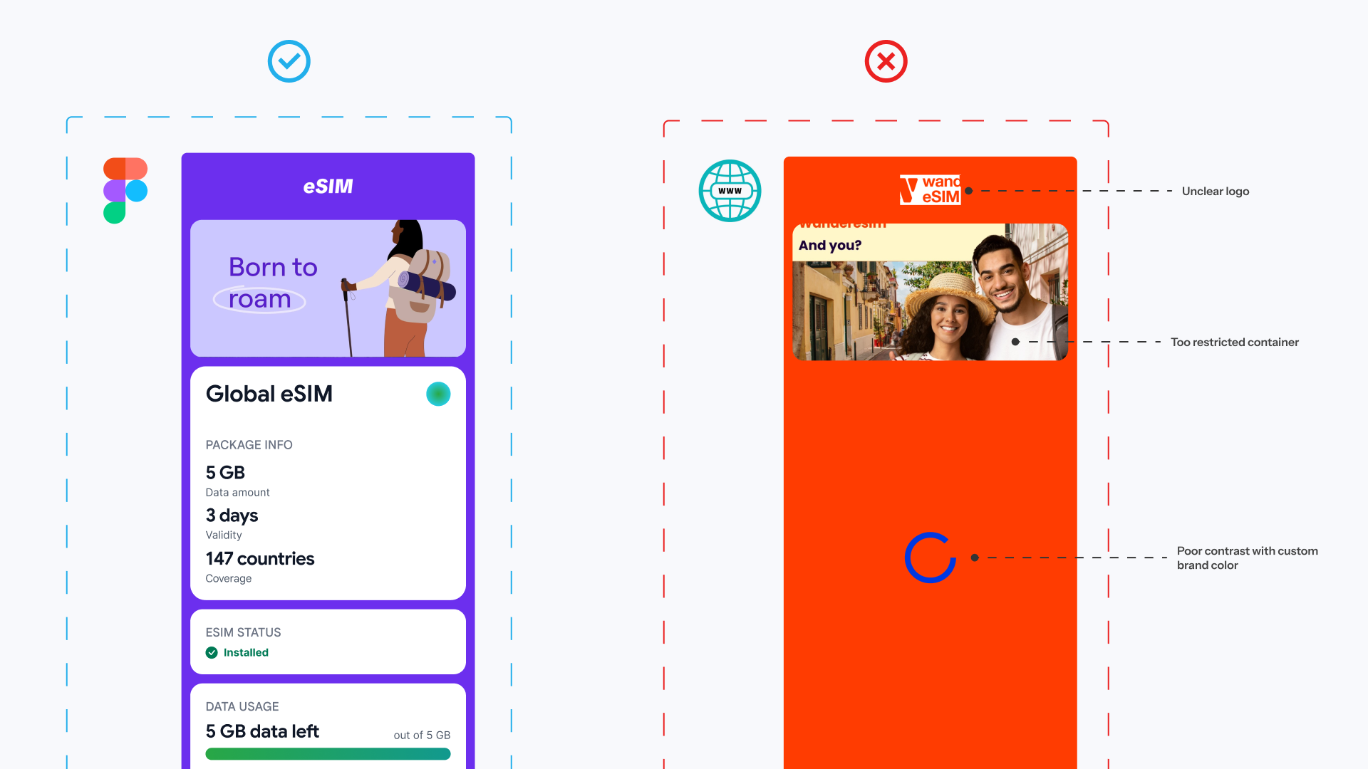
PM and stakeholders reviewed the working concept with real brand inputs. A colour that worked in one part of the preview could lose contrast or produce an unexpected state elsewhere. The PRD described the inputs, but not every combination.
That review made contrast a piece of dynamic product logic rather than a set of manually designed exceptions. The prototype exposed those failures while there was still time to change the model, before implementation or design QA.
Behaviour 1: choose text by contrast ratio
Accessibility became product logic
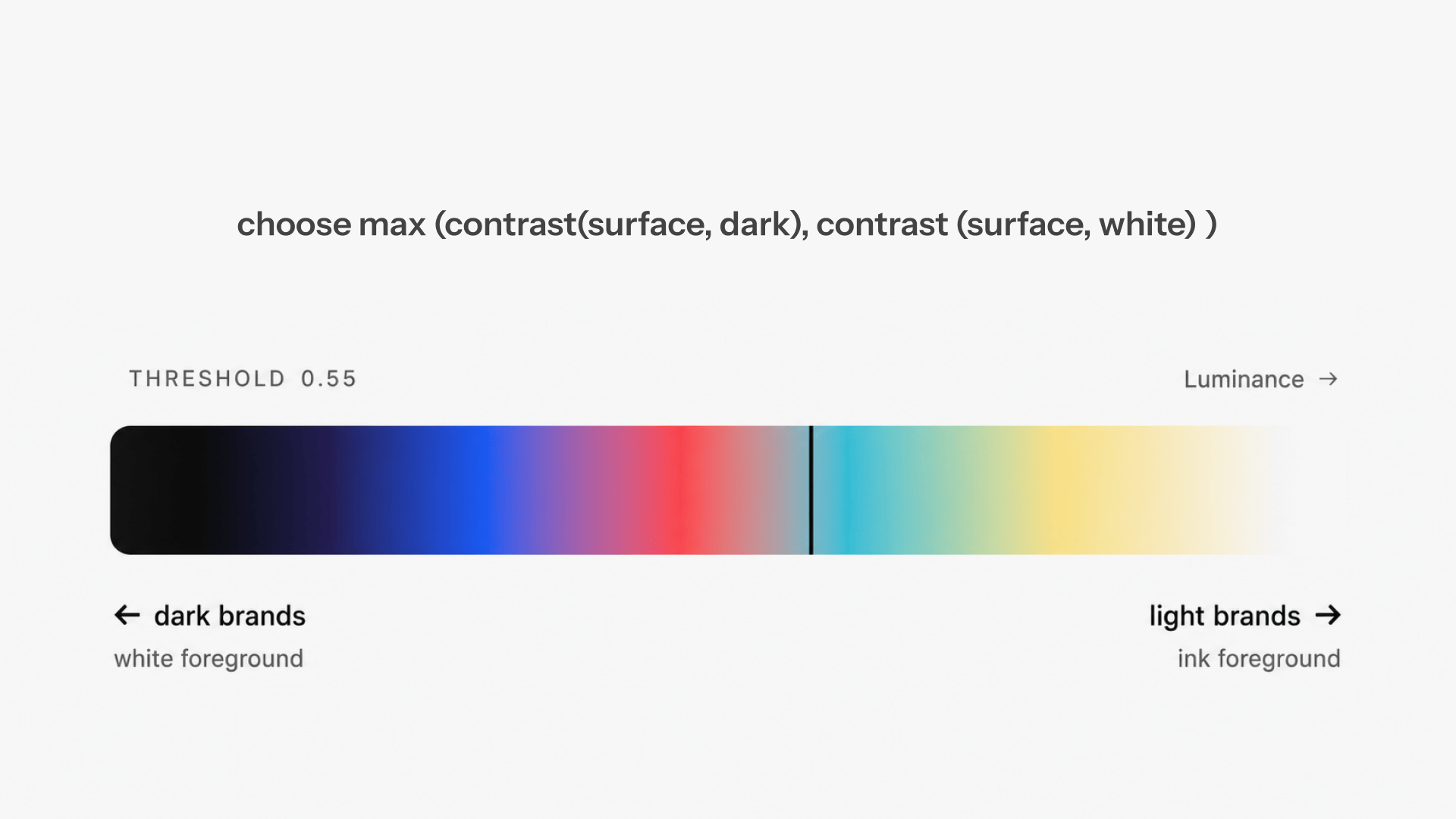
Based on that review, the preview calculates both candidate foregrounds and uses the one with the higher contrast ratio against the partner colour. This avoids relying on a fixed light-or-dark threshold for colours near the middle.
Behaviour 2: optional input changes the preview
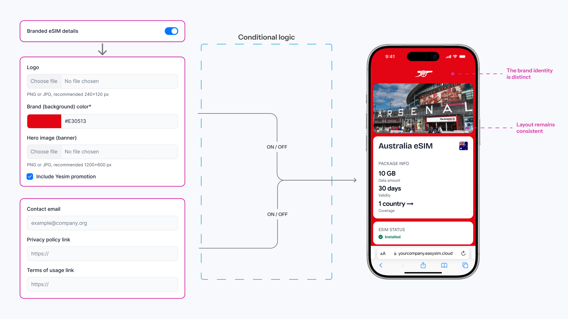
Contact links, promotion content, and partner branding appear only when the related settings are active and valid. The preview removes the region when the input disappears, so reviewers can see the resulting layout rather than infer it from annotations.
Behaviour 3: protect incomplete work
The prototype validates URLs, email addresses, colours, and required brand fields before save. Upload controls expose crop and file-shape problems. Save and reset actions track dirty state, and navigation warns when a change would be lost.
I also added loading skeletons and separate mobile and desktop previews. These were not finishing touches. They were the states most likely to be absent from a static handoff and rediscovered during implementation.
What the prototype delivered
Reviewable rules
The team could change real inputs and inspect the outcome in the browser.
Responsive states
Mobile and desktop previews shared the same configuration.
Edge-case coverage
Invalid fields, missing content, odd assets, and unsaved changes became visible.
Client conversations
A behaving product concept made the proposal more concrete for existing B2B clients.
Engineering did not ship the prototype code directly. They reimplemented the experience in the production codebase, using the working concept as the reference for its interaction model and product rules.
After launch, no contrast-related issues surfaced during design QA. I treat that as a qualitative observation, not a measured KPI, because there was no fixed reporting window or formal QA record.
Reflection
I would make the same tool choice again. One polished state hides too much in a branching system. A small working model made the unresolved parts hard to ignore.