One design system for three B2B products
I replaced three drifting UI libraries with one shared foundation. Similar Figma setup work took about one quarter of the previous effort, and we saw around 30% fewer recurring style issues during design QA.
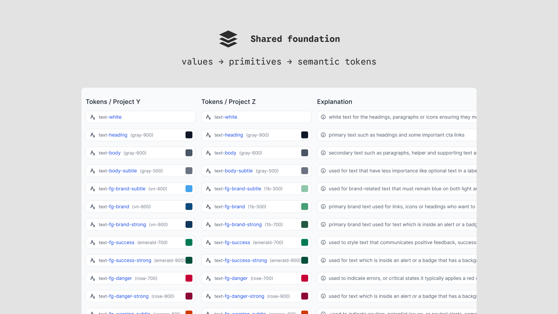
- ≈4×
- faster Figma preparation · operational estimate
- ≈30%
- fewer recurring style QA issues · operational estimate
- 48
- components in the mature library
- 140+
- tokens in the mature library
- Role
- Product designer
- Timeframe
- Sep–Dec 2025
- Scope
- Three B2B products
- Team
- PM · Engineering
Note: images and some details have been modified per agreement with Yesim.
Three products kept solving the same UI problems
Yesim’s B2B products shared workflows and engineering foundations, but their interfaces had grown independently. Similar tables, fields, filters, and status patterns used different structures and visual rules. A small change could trigger the same design discussion three times.
The products needed the same component structure without being forced into the same visual theme. I kept identity in semantic tokens, where it could change without duplicating the library.
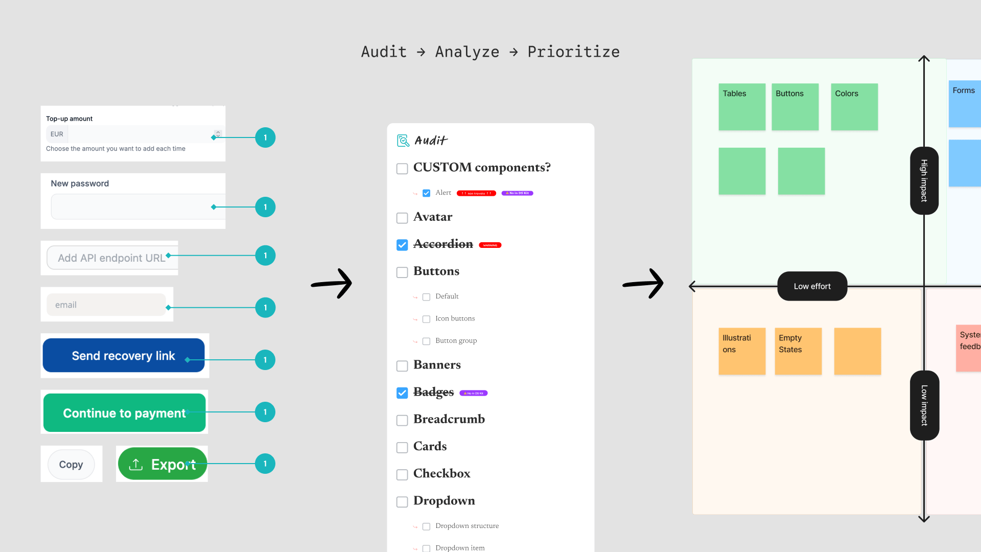
Success meant adoption, not a complete catalogue
My ownership
I owned the Figma architecture: shared component structure, reusable patterns, token hierarchy, and theming. I also worked through product-specific cases with engineers and handled design QA during adoption.
Engineering ownership
Engineers implemented the components and styles in the products. I clarified the design logic, worked through technical constraints and edge cases with them, and reviewed the result against the system.
Adoption happened product by product with PMs, engineers, and relevant stakeholders. There was no single design-system owner who formally approved all three. I used two practical success signals: less setup for designers and fewer visual inconsistencies during design QA.
Decision 1: name tokens by purpose
Move product identity out of component structure
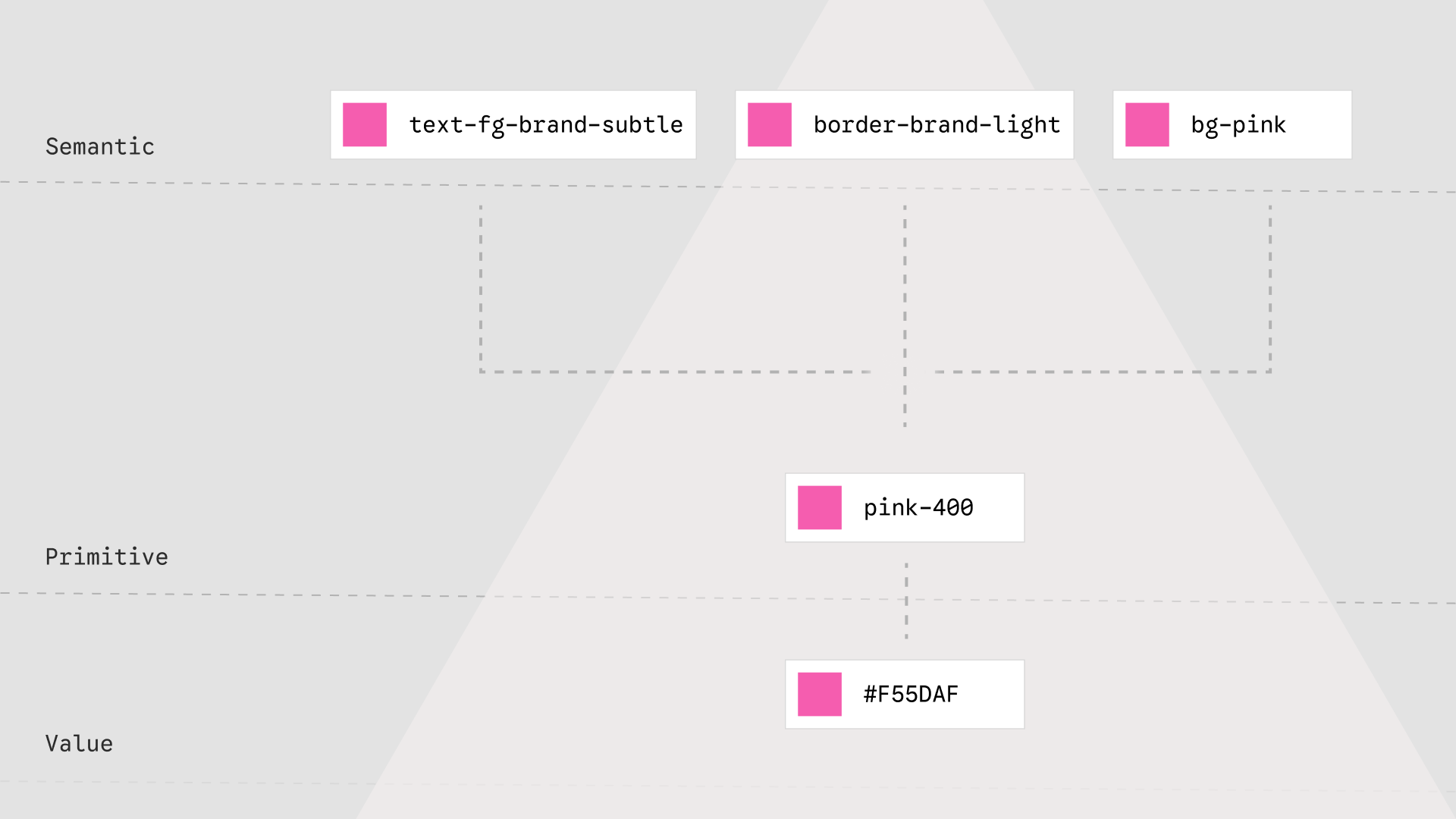
Raw colour values were too brittle, and primitive names such as blue-500 still described appearance. Semantic names such as color-action-primary described the job a value performed. Each product could point that token to a different primitive while the component kept the same anatomy and behaviour.
The extra token layer added naming work up front. It paid for itself by preventing a brand change from becoming a component fork.
Engineering challenged my first interactive-state names because they described the states from a design perspective. Production used CSS terminology such as :hover and :focus-visible. I renamed the Figma variants to match. That small change gave both teams one vocabulary and became a rule for the wider system: use implementation semantics when they make the design-to-code mapping clearer.
Decision 2: share anatomy, vary the theme
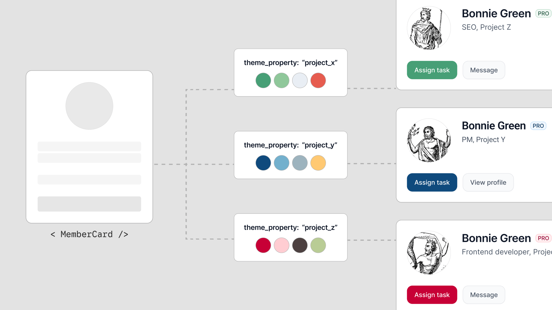
Buttons, fields, tables, and feedback states used one structural definition. The theme changed the values that belonged to the product: colour, type, radius, and density. Teams gained a distinct surface without maintaining a distinct component set.
Ship the system without pausing product work
A full rewrite would have delayed feature work and made the library feel like an external programme. I started with recurring, visible surfaces and let teams migrate them as related product work moved through delivery.
Forms and tables made up the first high-frequency scope. As each product adopted the system, I added patterns that proved reusable in real work and adjusted the architecture with engineering. The totals below describe the library at maturity.
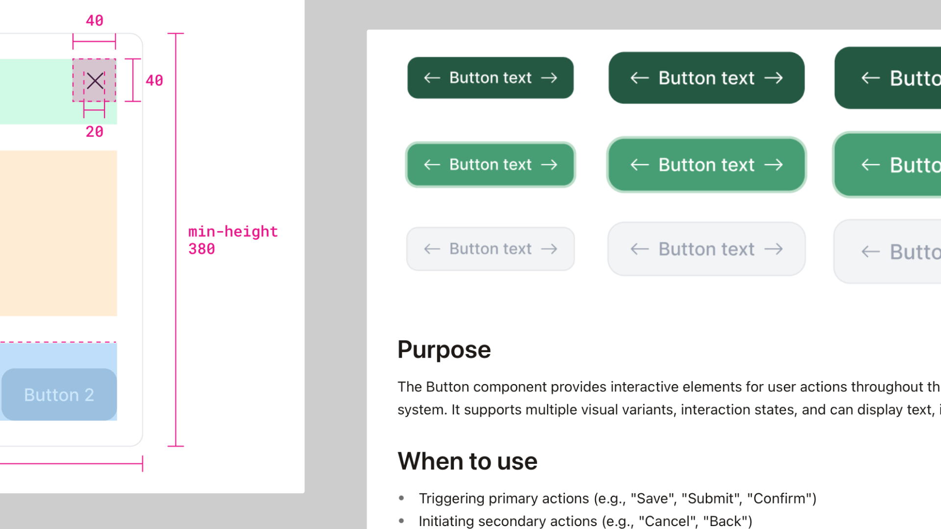
Each component included anatomy, states, usage guidance, accessibility notes, and implementation-facing specifications. That gave design and engineering one place to resolve a rule before it appeared in three products.
Result
The mature library grew to 48 components and more than 140 tokens across three product themes. In repeated, comparable setup work, Figma preparation typically took about one quarter of the previous effort. Comparable releases across all three products also surfaced around 30% fewer recurring style issues during design QA, including spacing, typography, colour, and component styling. Neither result came from a formal experiment or fixed reporting window, so I treat both as operational estimates.
I learned that adoption is mostly an operations problem. Teams used the system when it helped them finish current product work. Naming, documentation, and migration order mattered as much as the components.